This guide provides a high-level overview of how to build your own sales & marketing dashboard.
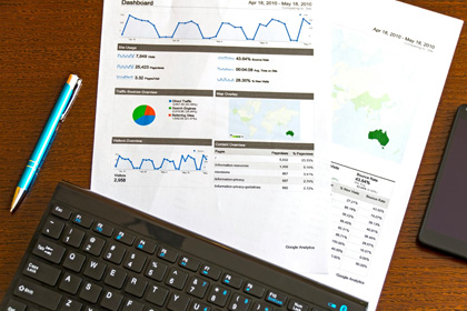
Are you a business owner or marketing executive who lacks a clear view of your results? Perhaps you're in a tough spot because your marketing agency isn't transparent about key performance indicators (KPIs) or overall sales and marketing performance. Imagine having a centralized view of your website , social media, and sales performance—all in one place. That's the power of a B2B sales & marketing dashboards.
I have years of experience creating dashboards in Google Data Studio (now Looker Studio), but it had been a while since I built one. Just a few weeks ago, I finalized the build of my B2B sales & marketing Dashboard for my agency.
The reason why I wanted to take on this endeavor is becuase I wanted a high-level overview of my KPIs so that I can focus on activities that drive results. If I am doing work for my agency but it's not leading to more sessions, leads, or sales this indicates to me that I need to change what I am doing. This was also a great exercise because I wanted to create dashboards for my clients that goes beyond just tracking website performance. It wasn't easy; after weeks of frustration, yelling at my computer, and browsing knowledge bases and videos, I finally got the dashboard built.
This guide is a high-level overview of how to build your own dashboard. It won't provide a step-by-step tutorial on how to build a specific dashboard with predefined KPIs. Instead, it's meant to point you in the right direction to build your own custom dashboard. I'm a firm believer that there's a lot of value in building custom dashboards because every business is unique. While many Looker Studio templates can help you get inspiration on how you can visualize your KPIs, based on my personal experience, there will always be some level of customization required.
Before we get into how to build your own dashboard, let's review why dashboards are important.
Dashboards are crucial for multiple reasons.
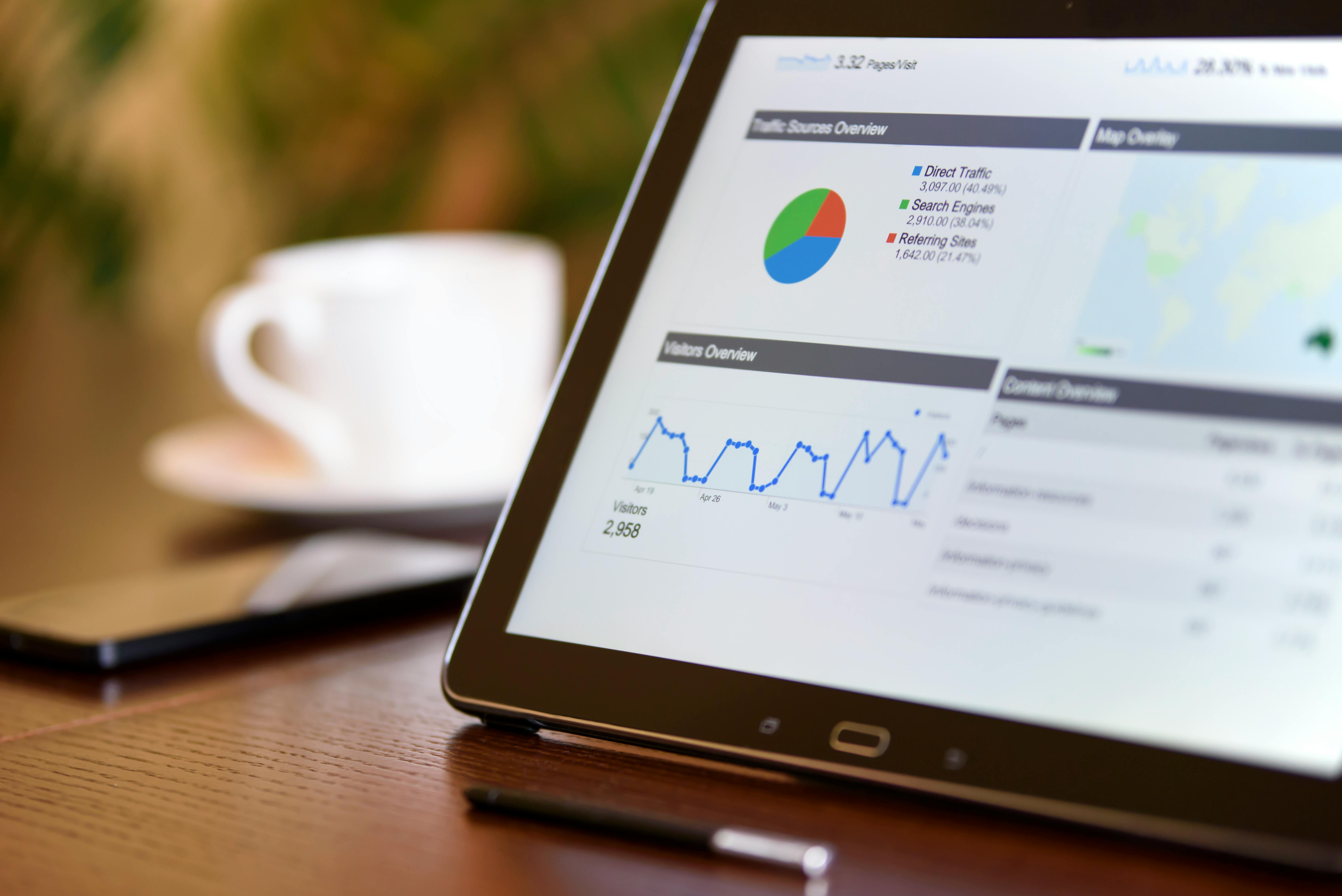
First, they provide a high-level overview of your business's KPIs without needing to log into each individual account or tool. I remember times when I would have log into Google Analytics to build one report and then log into a CRM to build another. It was a pain. With a dashboard, all this data is centralized, so you don't have to log in to each tool.
Second, dashboards streamline reporting to stakeholders. Another frustrating thing I had to deal with when managing multiple clients was the amount of hours I spent exporting and emailing reports as separate CSV or PDF files. With dashboards, you simply share a link with the people who need to see the sales and marketing information, and it's easily accessible to everyone. Another cool feature is that some dashboards offer custom controls so that users can filter data on things like specific time periods.
Another reason dashboards are important, is that they allow you to see key data side-by-side. I often found it valuable to be able to see the number of website visits, leads generated, and sales in the same interface. By reviewing these KPIs in the same UI, I could analyze data quicker and make informed the decisions more efficiently.
Furthermore, dashboards keeps teams accountable and ensure transparency. For example, when our clients hire us for marketing services we hold ourselves accountable to drive specific outcomes like increase website traffic or leads generated. Having the KPIs in a dashboard that can be review by us and our clients while projects are in-progress ensures we our on the right track to positive business outcomes and accomplishing goals.
Lastly, dashboard are important because they help teams adapt. For example, if my website visits are low but I'm still converting leads and sales, I would prioritize projects that would increase my website traffic. If my website visits are high but I'm not converting leads and sales, I can look into redesigning my landing page or evaluating my sales process for further improvement. Not actively monitoring KPIs, puts you and your business at risk of wasting time and resources on activites that are not driving results.
Hopefully, you're sold on the idea of dashboards by now. Let's actually go over how you would go about building one.
The first step to building a dashboard is to figure out what you want to measure and why. This should align with your business's short- and long-term goals. For example, when I started my agency, one of the things I struggled with the most was driving traffic to my website. One goal I set for myself was to increase my website traffic with SEO. I considered this a medium-term goal, aiming to get at least 500 sessions per month within six months to a year. For this specific goal and KPI, I decided a line chart with a year-to-date timeline would be the best visualization.
Also, during this stage, I started thinking about how specific KPIs can be visualized. Data can be displayed as line graphs, pie charts, scorecards, and more—the possibilities are endless. For my B2B sales & marketing dashboard I created a literal sales funnel visualization that showed website data and data from my CRM. At the top of the funnel I have website visits, then leads generated, presentations scheduled, and finally, contracts signed. In Looker Studio I had to create these as separate scorecards and style/space them apart to get the funnel visualization I desired.
Bonus tip: Before you start coming up with KPIs, you should have a solid understanding of your business and sales process. Before you start defining your KPIs. I recommend doing some stakeholder interviews and maybe even a customer journey map. Having this knowledge when I created my sales funnel visualization made it a lot easier because I new how the data needed to be formatted when I connected my CRM to Looker Studio.
The next step in creating an ultimate sales and marketing dashboard is to determine what tool you're going to use and test what can be integrated. You don't want to spend time, effort, and resources building a dashboard that can't be built. What I did was go straight into Looker Studio and start playing around with the integrations. I knew for a fact I wanted to connect to Google Analytics 4, my CRM, and other marketing tools. Dedicating time to get familiar with Looker Studio to make sure it provided all the integrations I needed was essential.
The next step is to wireframe the dashboard. The tool I used to create a wireframe was called Mockups. I really liked this tool; it had pre-created data visualization components that made it extremely easy to get a rough idea of what I wanted. This could also be a rough sketch—you don't have to use a dedicated tool. The whole point of this exercise is to get a general idea for feedback and review.
Bonus tip: If you are working with stakeholders, I highly recommend doing a "Crazy Eights" exercise. It's essentially a design workshop activity where you fold a piece of paper into eight sections and sketch out rough ideas with the group. This is very beneficial in UX design, and for projects related to data visualization as well.
Figma is a tool used to create high-fidelity visual designs for websites, apps, and dashboards without code. Consider using Figma if you are going to develop a custom dahsboard with code, need stakeholder approval and feedback, or if you are desiging this dashboard with many users in mind. Using Figma ensures everyone is on the same page on what the dashboard will look like once it is developed. Doing the design upfront avoids potential rework during development and streamlines developer handoff.
When I recently built my dashboard for my agency, I opted not to do this.. The reason I skipped this step was I was using Looker Studio. This tool is no-code which makes it easy to style and create data components. Also, when I was building this dashboard, I was the sole person using it. I didn't need to get feedback on the design from stakholders or anyone else. Doing a Figma design would have just slowed down the process. However, If was working with others I would maybe consider designing first in Figma even if I was using a tool like Looker Studio. One thing I am considering doing is creating a Figma UI Kit for Looker Studio.
The final step is actually building the dashboard. There are many tools out there, but the one I recommend is Looker Studio. One of the reasons I chose Looker Studio is many popular integrations already exist, and connecting to Google Analytics 4, YouTube, and Google Search Console is easy. The best part is that the tool is free to use. One important thing to note is that you might have to use a paid, third-party tool to connect data from a CRM, LinkedIn, and other channels. Two of the tools I've tested and used are Coupler.io and Funnels.io. With a stronger for preference for Coupler.io.
As mentioned earlier, Looker Studio is a no-code tool that allows you to drag data visualization components such as charts, tables, graphs, and scorecords onto a canvas. From there you chose the data source for each component, style it, and place it accordingly in a drag & drop UI.
Bonus tip: Before building the dashboard, make sure you've completed any necessary setup in the tools that will be sending data to Looker Studio first. For example, I had to make sure my event tracking was set up in Google Analytics 4. Events such as form submissions, PDF Downloads, Newsletter Sign-ups etc need to be setup as Key Events in GA4 first. This made it easy to create KPIs and Data Visualizations for Total Conversion Rate.
This project took me a while to complete. Even though I had prior experience with Looker Studio, I had to deal with a lot of headaches that I had never dealt with before because I was build completly new data visualizations.. But I'm glad I did it.
I love building custom dashboards for my clients. If you would like a Looker Studio dashboard that's relevant to your business needs, whether for sales, marketing, or other KPIs, feel free to contact us!
And lastly, if you want to use the sales and marketing dashboard template that I built for my agency, feel free to click on the link below to gain access to it. I hope you got value from this article!